

The Surf Nest Airbnb
- Brand identity
- Content Creation
- Logo design
- Print and signage design
- Meta ad creative
The Surf Nest: a surf-stay brand identity in Madeira
A holiday rental is a brand, whether it acts like one or not. Guests judge it in a two-second scroll, remember it by the welcome at the door and recommend it by name. Pulso Social Marketing built The Surf Nest's brand identity in Madeira, from the first logo sketch to the sign in the car park.
The brief: stand out in a sea of listings
Machico has sun, a sandy beach and some of the island's best surf, so it has no shortage of rentals. Online, they blur together: white walls, a sofa, a sea view, a price.
The Surf Nest needed more than good photos. It needed an identity guests recognise at every step: the ad they scroll past, the listing they book, the book on the coffee table, the sign that shows them where to park.
Step one, The logo: wave, sun and a home base
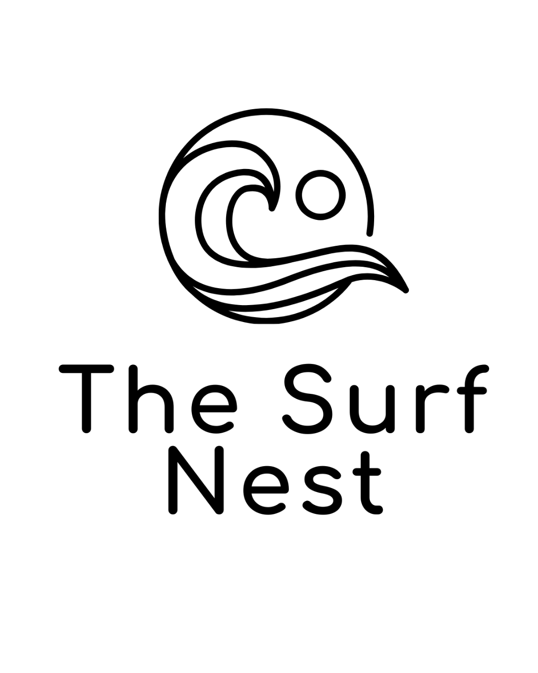
The logo is drawn in one confident line. A wave curls inside a circle, with the sun resting in its curve. It says surf, and it says shelter: the nest is the wave that wraps around you.
The wordmark is a rounded, open sans-serif that reads as easily on a keybox as on a car park sign. We built three versions: a full-colour roundel, a white logo that sits over photography, and a single-colour line logo for print and signage.
Step two, the full Brand guidelines design
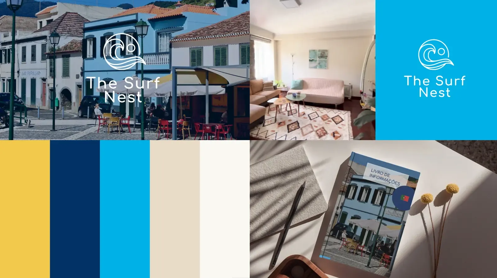
A brand works when it stays consistent. We set a tight palette taken straight from the place:
- Ocean blue: the Atlantic off Machico, and the lead brand colour
- Deep navy: headlines, contrast and calm
- Sunshine yellow: the warm accent
- Sand and off-white: neutrals that let photography breathe
Everything lives in a shared Canva brand kit: logos, colours, fonts and templates. The owners create on-brand content in minutes, without a blank page or a new design brief every time, giving them the full autonomy they wanted.
Step three, variations for all marketing collaterals: From the first ad to the front door
We designed every guest touchpoint, so the brand feels the same at each step of the stay.
- Guest welcome book design and flyers
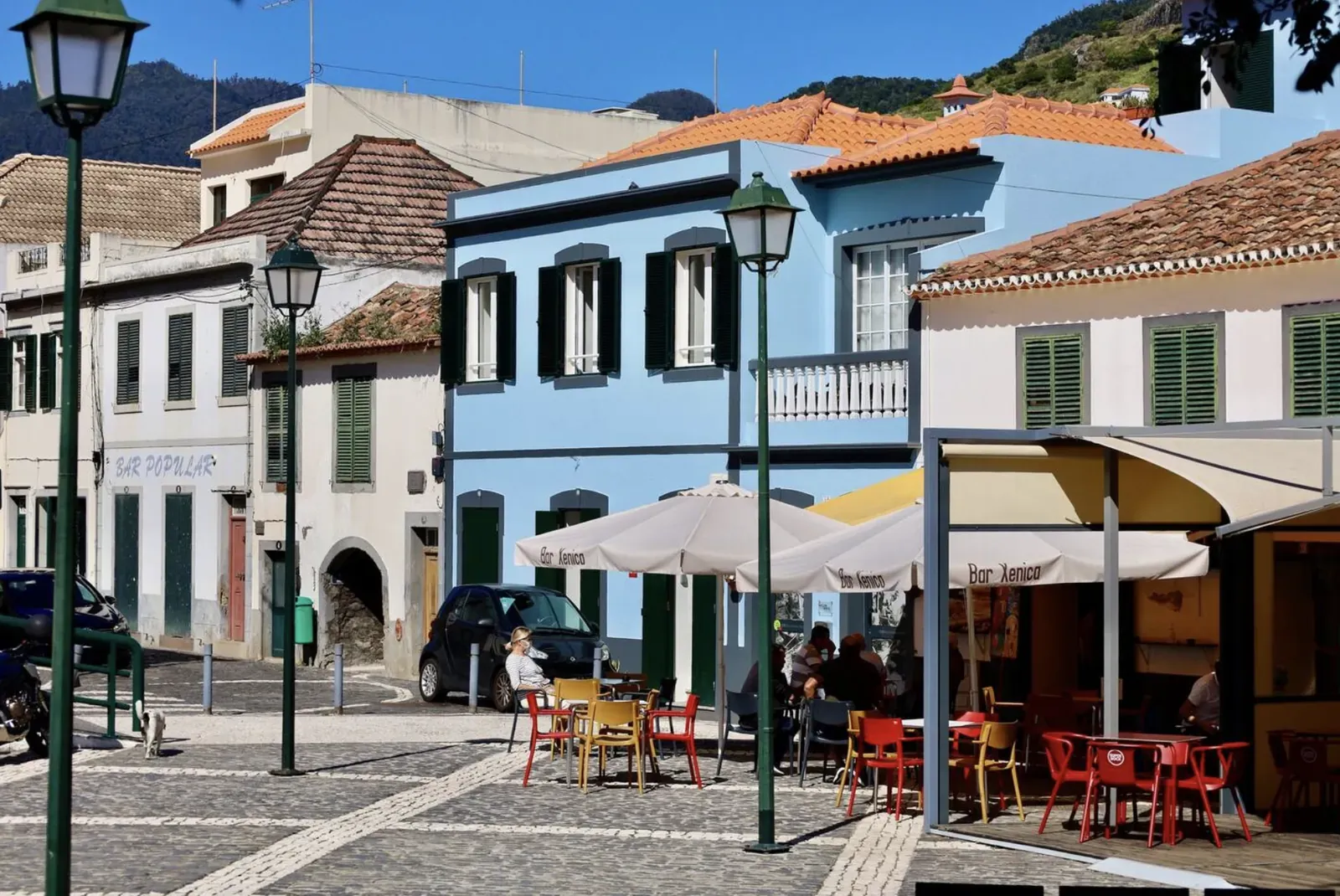
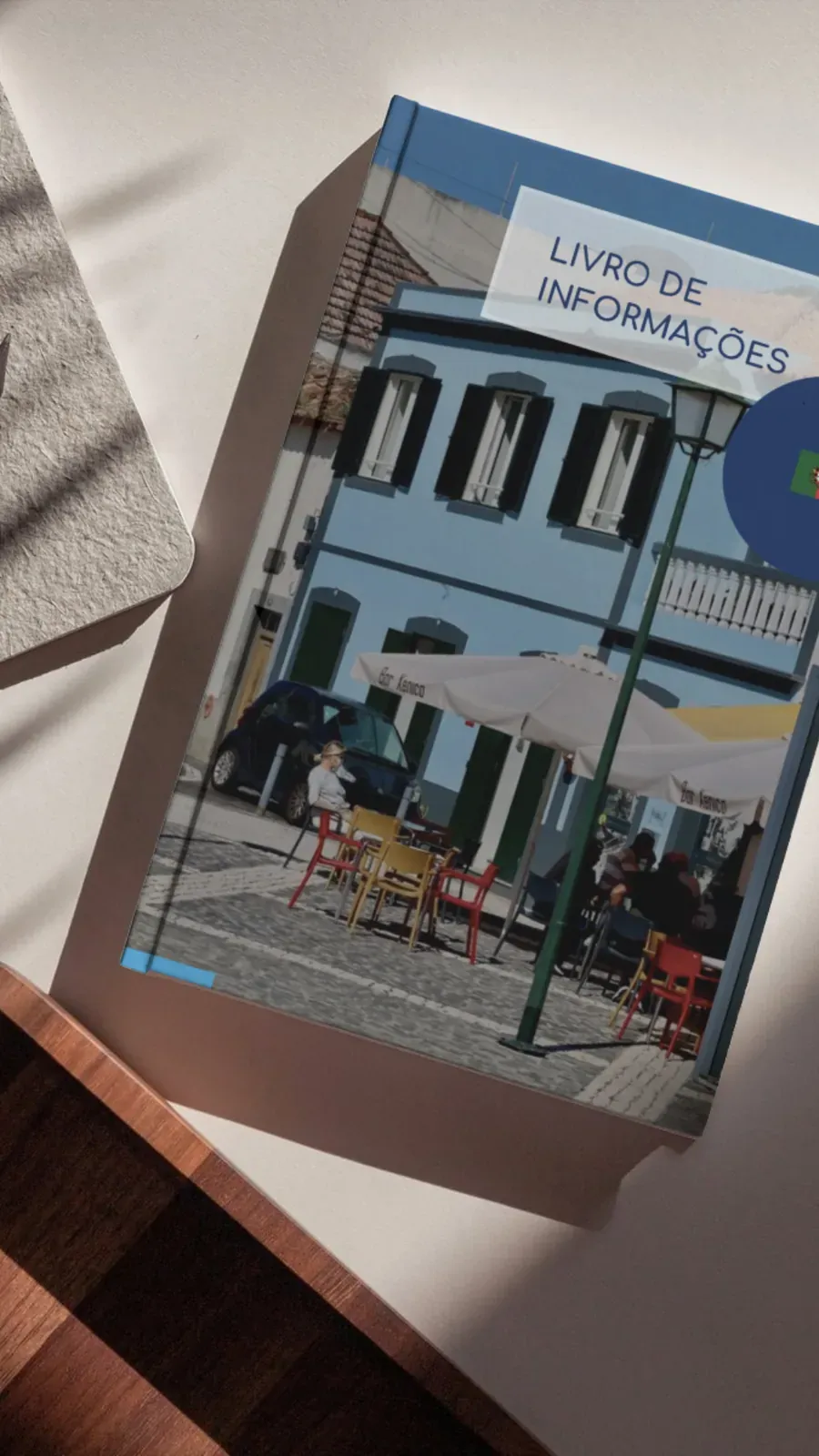
The Welcome Book is the guest's companion for the whole stay. Its cover shows Machico's old town and the Surf Nest airbnb: blue façades, café terraces, the street guests will walk down. Inside, all the useful information guests will need during their stay, saving precious time for the owners: The practical information is laid out so guests find answers fast, without messaging the host.
Print flyers carry the logo, the palette and a clear call to book. They turn the identity into something guests can pick up, keep and pass on.
- Meta ad creative
For Instagram and Facebook, we built vertical story ads and sponsored posts around real footage of the apartment. Brand colours frame the video, the nightly price leads, and the contact sits where thumbs land. Each ad reads as The Surf Nest before the logo appears.
- Signage and wayfinding
Branding doesn't stop at the screen. Branded building signage and parking signs mark the guest space, and a keybox sign makes self check-in obvious. Guests arrive, find their way and feel looked after from the first minute.
The result: one brand at every touchpoint
The Surf Nest now looks like one professional business everywhere a guest meets it. The ad, the listing, the welcome book and the on-street signs speak the same visual language.
That consistency builds trust before arrival and recall after checkout. It's what turns a single stay into a review, a recommendation and, next time, a direct booking.
Need a brand for your holiday rental or business?
From website creation, logo design to print, social media, ads and signage, Pulso Social Marketing builds brand identities in Madeira that work everywhere your customers look.